Illustrating the Urban Landscape: Watercolor Techniques for Cityscapes in Procreate
Creating stunning urban landscapes in a digital format requires a blend of artistry and technique. Procreate, a powerful digital illustration app, provides numerous tools and functionalities to help artists capture the essence of bustling cityscapes in vibrant watercolors. This article aims to delve into the world of watercolor painting within Procreate, offering step-by-step guidance on how to illustrate captivating urban scenes. Whether you’re an experienced digital artist or a beginner exploring new mediums, this guide will equip you with the skills and inspiration to bring the colourful complexity of city life to your digital canvas.
Table of Contents
Toggle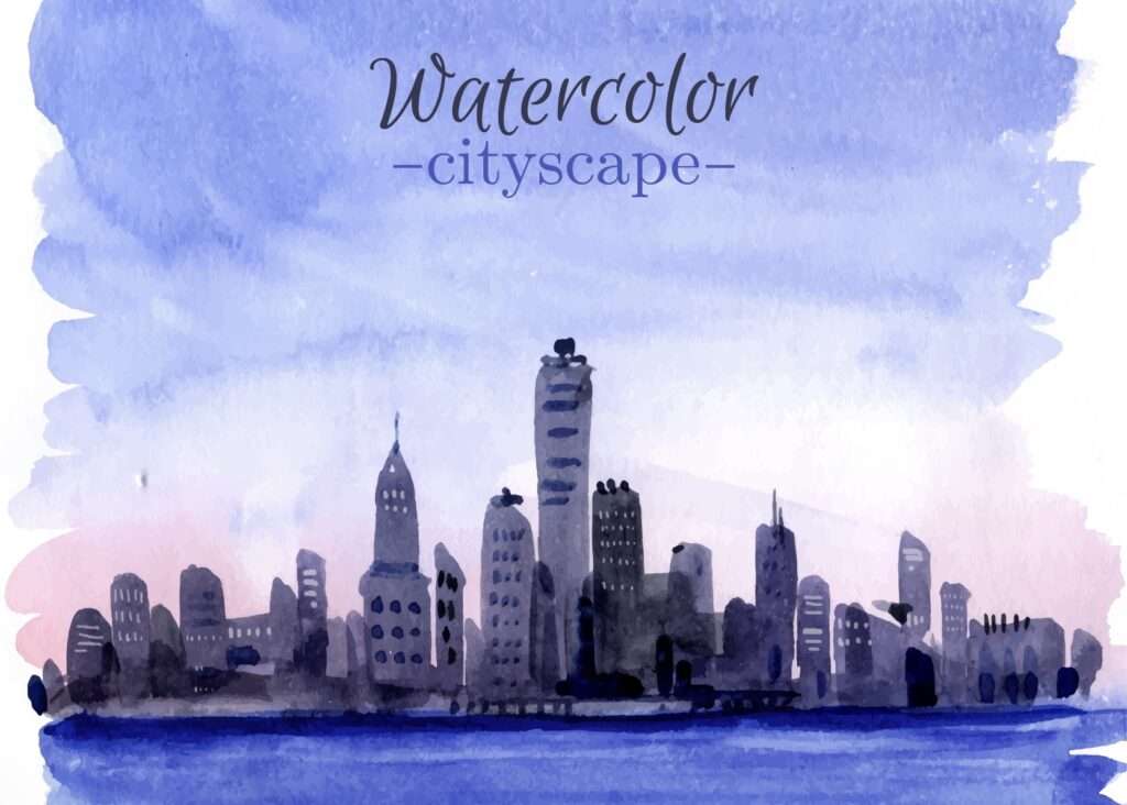
Canvas + Layers set up
To start, open Procreate and create a new canvas with dimensions that suit your project; a recommended size for detailed work is 3000 x 4000 pixels with a resolution of 300 DPI. Using higEnsuring Sharp and Printable Artwork
Setting Up Layers for Organized Workflow
Begin by setting up your layers to keep your workflow organized. Create an initial “Background” layer and fill it with a base color that complements your final vision; light grey or beige can work well as placeholder colors.
Drafting the Outline with the “Sketch” Layer
- Above the “Background” layer, add a new layer titled “Sketch”. This is where you’ll draft the outline of your cityscape using a soft pencil brush to sketch the broad shapes and outlines of your urban scene.
Finalizing Outlines in the “Inking” Layer
- Add a new layer above the “Sketch” layer and name it “Inking.” Here, you’ll refine and finalize the outlines with a precise inking brush. Reduce the opacity of the “Sketch” layer to make tracing easier.
Creating Additional Layers for Detailed Sections
- Subsequently, create multiple additional layers based on specific sections of your artwork, such as “Foreground,” “Middle ground,” “Background,” and “Details.” This separation allows for adjustments without affecting the entire project.
Organizing Layers for Efficiency
- Finally, organize your layer stack by grouping related layers together, like all elements related to the background in a “Background” folder. Proper layer management simplifies the painting process and makes it easier to apply effects and corrections.
Color Palettes
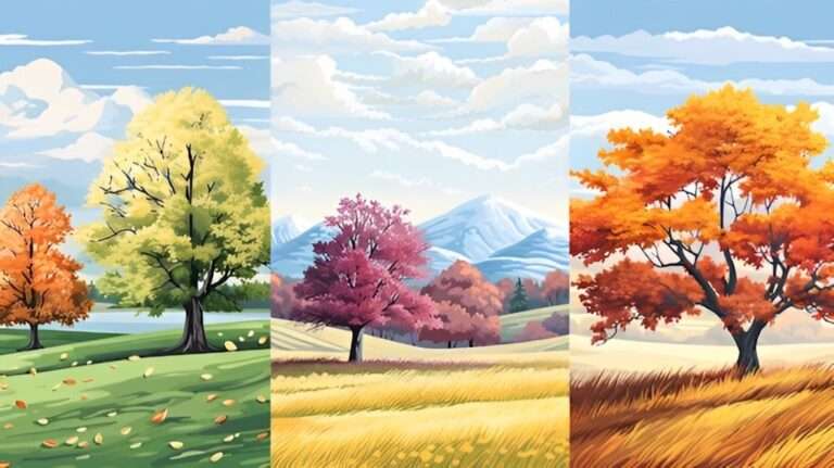
Selecting the right color palette is crucial to breathe life into your digital urban landscape. Start by choosing a color scheme that is harmonious and fits the mood of your illustration. There are several color palettes to consider: monochromatic, analogous, complementary, and triadic, each offering a unique visual appeal.
- Monochromatic: This palette uses variations in lightness and saturation of a single color. It’s ideal for creating a cohesive and soothing look, perfect for minimalist cityscapes or scenes set under specific lighting conditions like dusk or dawn.
- Analogous: These colors sit next to each other on the color wheel and usually match well to create serene and comfortable designs. They are often found in nature and are pleasing to the eye, making them ideal for illustrating detailed and vibrant urban scenes.
- Complementary: This color scheme uses colors that are opposite each other on the color wheel. They create high contrast and vibrant look, perfect for making certain architectural features or elements pop within your cityscape.
- Triadic: Uses three colors that are evenly spread around the color wheel. This palette provides a high degree of contrast yet retains harmony, making your artwork visually striking without being overwhelming.
Once you’ve selected your color scheme, create swatches of your chosen colors and incorporate them in different elements of your illustration. Working from broad areas to fine details, fill in large sections using base colors first, then gradually build up depth with shading, highlights, and texture.
It’s also important to pay attention to lighting and atmosphere. Experiment with blending modes and opacity settings to add realism and ensure that the colors work well together under different lighting conditions. This not only enhances the overall aesthetic but also conveys the intended mood and setting of your urban landscape illustration effectively.
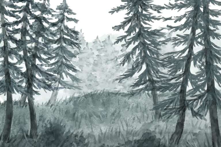
Photo and Life’s Reference
Using Real-Life Photos for Urban Landscape Illustrations
Utilizing real-life photos as references is crucial for crafting accurate and engaging urban landscape illustrations. These photos offer a treasure trove of visual information, capturing everything from architectural nuances to the subtle interplay of light and shadow—all of which might be elusive when relying solely on imagination.
Tips for Selecting Photo References
- Choose photos that mirror the composition, lighting, and atmosphere of the scene you aim to create.
- Examine the perspectives carefully to add a realistic depth and spatial awareness to your drawings.
- Observe how buildings relate to their environment, the incorporation of natural elements in urban areas, and the vibrancy human activities add to the scene.
Incorporating Life References
Working from life involves drawing or painting based on what you see in real-time. This hones your ability to observe and capture the essence of the bustling urban life.
Tips for Working from Life
- Engage in regular sketching sessions outdoors to enhance your observational skills.
- Try to encapsulate the energy and movement of the urban setting, translating three-dimensional views onto your canvas.
- Practice capturing perspectives, proportions, and scales accurately to improve your overall technique.
Combining Photo and Life References
Merging photo references with life drawing can amplify the effectiveness of your illustrations. Photos offer a meticulous and unchanging viewpoint for in-depth study, while life drawing injects a layer of spontaneity and vitality into your work.
Tips for Effective Reference Combination
- Use photos to grasp complex details and ensure technical accuracy in your illustrations.
- Incorporate sketches from life to breathe life and movement into your work, creating more dynamic and engaging visuals.
- Experiment with blending techniques from both methods to enrich the narrative and atmosphere of your urban landscapes.
Drawning the Main Focal Elements
Identifying the Focal Elements
When drawing an urban landscape, pinpoint the elements that will capture the viewer’s attention. This could be a landmark, a market square, or a skyscraper, placed prominently within the composition using the rule of thirds or golden ratio for balance.
Sketching the Focal Point
Start with the basic outline of your focal element, focusing on accurate proportions and perspective. Use photo references or observe directly to ensure precision. The main feature should be detailed yet not overpower the scene.
Adding Lighting and Shading
Light and shadow are crucial for realism, making the focal element appear three-dimensional. Employ techniques like hatching and cross-hatching to add depth, ensuring that highlights and shadows are consistent with the scene’s overall lighting.
Enhancing with Surrounding Details
Use surrounding elements like streets or rivers as leading lines towards the focal point. Background and foreground details should frame the main feature, guiding the viewer’s eye and enhancing focus.
Incorporating Human Elements
Adding human figures or vehicles can bring scale and life to the scene. These should complement, not distract from, the focal element, contributing to the scene’s narrative.
How to create darker edges
Creating darker edges is essential in adding depth and emphasis to your artwork. One effective method is to increase the pressure on your pencil or drawing tool as you outline the edges of your elements. By applying more pressure, the lines become thicker and darker, naturally drawing attention to the edges.
Another technique involves layering. Start with a light sketch and gradually build up the darkness by going over the edges multiple times. Using different grades of pencils, from HB to 6B, can help achieve various levels of darkness to create a more realistic gradient.
Blending is also crucial. After darkening the edges, use a blending stump or your fingertip to soften the transition between the dark edges and the lighter interior areas. This creates a more cohesive and polished look.
Lastly, consider the light source in your scene when darkening edges. The side of an object opposite the light source will naturally have darker shadows, so emphasizing these areas will enhance the overall realism and three-dimensionality of your artwork.
Adding details
The Importance of Refinement
Adding intricate details is the final step in bringing your artwork to life. These finer elements can differentiate between a simple sketch and a masterpiece, providing texture, depth, and realism. To begin with, consider the textures of the various materials depicted in your scene. Whether it’s the rough bark of a tree or the smooth surface of water, details like these can significantly enhance the viewer’s experience.
Techniques for Detailing
Utilize varying pencil strokes to replicate different textures. Short, quick strokes can mimic the appearance of fur, whereas long, fluid lines may represent flowing water or windblown grass. Another approach is stippling—using small dots to create texture and gradient. This technique is particularly effective for depicting surfaces like sand or rough stone.
Focus on Key Areas
While adding details across your entire artwork is important, focusing on key areas can create focal points and draw the viewer’s eye. Pay particular attention to the central elements of your composition and areas of interest. Overloading the entire piece with details can be overwhelming; instead, balance detailed segments with less intricate areas to allow the composition to breathe.
Adding shadows
Shadows play a crucial role in enhancing the depth and realism of your artwork. To begin, identify your light source and determine where shadows would naturally fall. Use softer, blended strokes to create gradual transitions from light to dark, and harder, more defined lines for sharper shadow edges. The intensity and direction of the shadows should consistently align with the light source, adding coherence to the overall composition. Incorporating shadows not only grounds objects but also adds a sense of volume and three-dimensionality.
Painting Reflections
Reflections add a mesmerizing dimension to artwork, effectively capturing the interplay between the subject and its mirrored image. To paint accurate reflections, start by closely observing the reflective surface, whether it’s water, glass, or a shiny object. Notice how the colors, shapes, and details of the subject are reproduced, often in a slightly distorted manner. When painting water reflections, for instance, consider the movement of the water and how it impacts the clarity and shape of the reflected image. Use softer, horizontal brushstrokes to mimic the surface tension and subtle ripples of water. Adjust the brightness and saturation of the reflection to be slightly less intense than the actual subject, enhancing the illusion of depth. Paying attention to these nuances helps in creating visually compelling reflections that enhance the realism and dynamism of your composition.
Painting the Main Elements
Establishing Focus and Building Detail in Art
When it comes to painting the main elements in a composition, it’s crucial to establish focus and clarity to effectively communicate the central themes and subjects of your artwork. Start by defining the primary subjects that will draw the viewer’s attention. These could be the most prominent figures or objects within the scene. Begin with basic shapes and outlines to lay the groundwork, ensuring that the proportions and positions are accurate. From there, build up layers of detail, gradually introducing highlights, midtones, and shadows to create depth and dimensionality.
Enhancing Visual Impact with Color and Texture
Select a color palette that enhances the key features and themes of your main elements. Pay attention to color harmony and contrast, as this can greatly impact the visual impact and balance of your composition. For instance, cooler tones can recede into the background, while warmer tones can bring elements forward. Texture also plays a significant role—experiment with different brushstrokes and techniques to replicate the surface qualities of your subjects, be it the rough texture of tree bark or the delicate feathers of a bird. Remember to keep an eye on the overall composition, ensuring that the main elements integrate harmoniously with the background and other details. This cohesive interaction between the foreground and background will help to create a unified and compelling piece of art. By meticulously planning and executing these steps, you can create striking and vibrant main elements that serve as the focal point of your painting, drawing viewers into your envisioned world.
Final touches
The final touches of your artwork are what elevate it from proficient to exceptional. This stage involves refining the smaller details and making subtle adjustments that enhance the overall impression. Start by stepping back and observing your piece from a distance, assessing the balance and harmony of the elements. Look for any areas that may need more attention, whether it’s adding a touch of light to a shadowed region or softening transitions where colors meet. Fine-tuning the highlights and shadows can add a sense of realism and vibrancy, ensuring that the focal points stand out as intended.
Additionally, consider the use of glazing or thin layers of transparent paint to enrich the color depth and add a luminous quality to your work. This technique can create a profound change in the tone and mood of your painting. Finally, scrutinize the edges of your elements—crisp, clean lines can sharpen the appearance, while softer, blended edges can suggest movement or a gradual transition. These finishing touches ensure your artwork is polished and cohesive, ready to captivate and engage the viewers.
Procreate Watercolor Brushes by AF Brush Packs
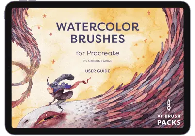
Elevate your Procreate sessions with our meticulously designed watercolor brushes, crafted to mimic the fluidity and subtlety of traditional watercolors. Experience precise control and unparalleled responsiveness, allowing for effortless blending, layering, and texture creation that brings you as close to real watercolor as digital art can achieve.
Embrace the most of your Procreate experience with results that are as professional with AF Brush Packs!