Capturing the Seasons with Procreate Watercolors: A Step-by-Step Guide
As digital artists, we have the freedom to explore various mediums and styles right at our fingertips. One of the most enchanting ways to bring life to your digital canvas is by capturing the essence of different seasons using watercolor techniques in Procreate. This step-by-step guide will walk you through the process of painting each season, from the blooming vibrancy of spring to the serene stillness of winter.
Table of Contents
Toggle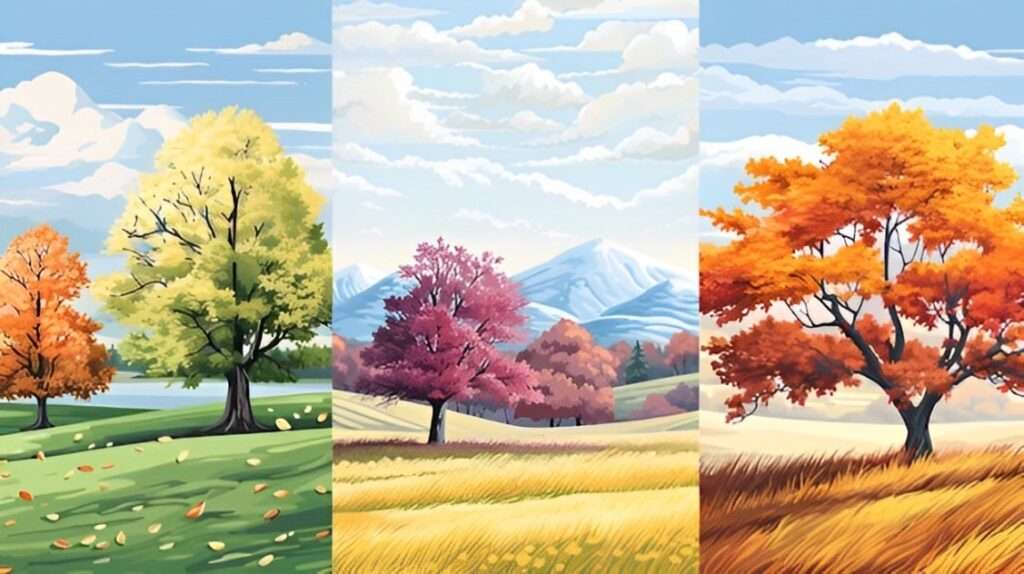
Capturing the Seasons with Procreate Watercolors: A Step-by-Step Guide
As digital artists, we have the freedom to explore various mediums and styles right at our fingertips. One of the most enchanting ways to bring life to your digital canvas is by capturing the essence of different seasons using watercolor techniques in Procreate. This step-by-step guide will walk you through the process of painting each season, from the blooming vibrancy of spring to the serene stillness of winter.
Painting Spring
Choosing Your Color Palette
The first step in capturing the spirit of spring is to select a color palette that embodies the season’s vibrancy and renewal. Think of the fresh greens of budding leaves, the bright yellows of daffodils, and the soft pinks of cherry blossoms. A well-thought-out palette is crucial as it sets the tone for your entire artwork. In Procreate, you can create a custom palette by selecting the color wheel and experimenting with different hues until you find the perfect combination.
Creating a Basic Sketch
Before diving into watercolor techniques, it’s essential to lay down a simple sketch of your spring scene. This sketch will serve as the backbone of your painting, giving you a clear roadmap to follow. Utilize Procreate’s pencil brushes to sketch lightly, focusing on major elements such as trees, flowers, and any other focal points. Don’t worry about the details at this stage; keep your lines loose and fluid.
Applying the First Wash
With your sketch in place, it’s time to apply the first wash of watercolor. Select a broad, soft brush from Procreate’s brush library and begin painting with your chosen spring colors. Start with lighter shades and gradually build up the intensity. Use sweeping, fluid motions to mimic the natural flow of watercolor. One of the advantages of Procreate is the ability to adjust the brush’s opacity and flow, giving you greater control over the paint application.
Building Up Layers
The beauty of watercolor lies in its layering potential. Each new layer adds depth and richness to your painting. In Procreate, create multiple layers for different elements of your scene. For instance, have one layer for the background sky, another for the midground foliage, and separate layers for individual flowers. Working in layers allows you to make adjustments without disturbing the underlying work and helps maintain the delicate, translucent quality of watercolor.
Adding Details and Textures
As your painting progresses, focus on adding finer details and textures to bring your spring scene to life. Use smaller brushes to paint the intricate patterns on petals, the veins of leaves, and the textures of tree bark. Procreate offers various texture brushes that can simulate the look of natural elements, enhancing the realism of your artwork. Pay attention to the direction of your brushstrokes; they can convey the sense of movement and growth inherent in spring.
Final Touches
Finally, take a step back and evaluate your work. Make any necessary adjustments to color balance, contrast, and composition. Add final touches such as highlights or shadow enhancements to give your painting a polished look.
Painting Summer
Capturing the Essence of Summer
Choosing a Colour Palette
Select hues that convey summer’s warmth and energy: golden yellows, lush greens, and deep blues. Procreate’s colour wheel and palette options are useful for mixing and matching.
Establishing the Background
Start with a summery sky—clear azure or with fluffy white clouds. Use broad brushstrokes for base colours and finer strokes for details. Create a gradient from deeper blue at the top to lighter hues at the horizon.
Focusing on Landscape Elements
Beach scenes: Layer shadows and highlights for sand texture using Procreate’s textured brushes.
Garden scenes: Capture leaf colour variations and add details like sunflowers to evoke summer’s abundance.
Considering Light and Shadows
Summer light is bright with strong contrasts. Use blending modes and layer adjustments in Procreate to enhance these effects. Add movement elements like swaying trees or crashing waves.
Adding Minute Details
Include small details like insects, sunbeams, and reflections to add authenticity. Use Procreate’s detailing tools to refine these elements without overcrowding the scene.
Painting Fall
Capturing the Essence of Fall
Fall, or autumn, is a season characterized by its rich tapestry of colors, reflective mood, and gradual transition from the warmth of summer to the chill of winter. Capturing the essence of fall in a painting requires an attentive eye to the unique hues, textures, and atmosphere that define this time of year.
Choosing a Colour Palette
To embody the spirit of fall, select a palette dominated by warm, earthy tones. Deep reds, burnt oranges, golden yellows, and rich browns are indispensable for replicating the look of autumn leaves. Accentuate these with splashes of dark greens and purples to suggest the last remnants of summer and the beginning of winter’s approach. Procreate’s extensive range of colour tools, including the colour wheel and customization options, will come in handy for achieving the precise shades needed.
Establishing the Background
Begin by setting the stage with an autumnal sky. Opt for a softer, more muted blue compared to summer skies, frequently interspersed with grey clouds suggesting overcast days. Base layers should start with broad, sweeping strokes to create a sense of depth and distance. Gradients from dusky blues to gentle pinks or oranges near the horizon can evoke the crisp, clear evenings of fall.
Focusing on Landscape Elements
Paint rural landscapes adorned with fallen leaves carpeting the ground, or urban scenes with pumpkins and autumnal decorations. Use Procreate’s various brushes to add texture and detail to elements such as tree bark, leaf piles, or dewy grasses. Pay special attention to how fallen leaves accumulate in different areas and how they change in color as they decay. Adding elements like harvest crops or forest animals preparing for winter can enrich the seasonal narrative.
Considering Light and Shadows
Fall sunlight casts a golden, diffused glow, creating long and soft-edged shadows. Adjust Procreate’s light and shadow settings to mimic this distinctive effect. Position your light source low in the sky to emulate the sun’s angle during fall months. Emphasize the interplay of light filtering through branches, creating dappled patterns on the ground.
Adding Minute Details
Incorporate details that draw viewers into the scene: the texture of rough tree bark, the sparkle of morning frost on leaves, or the gentle sway of a scarecrow in a field. Procreate’s precision tools can help meticulously render these delicate touches, ensuring a balanced composition without overwhelming the viewer.
By carefully considering these elements, you can create a vivid and evocative representation of fall, full of the nuanced beauty that makes the season so beloved.
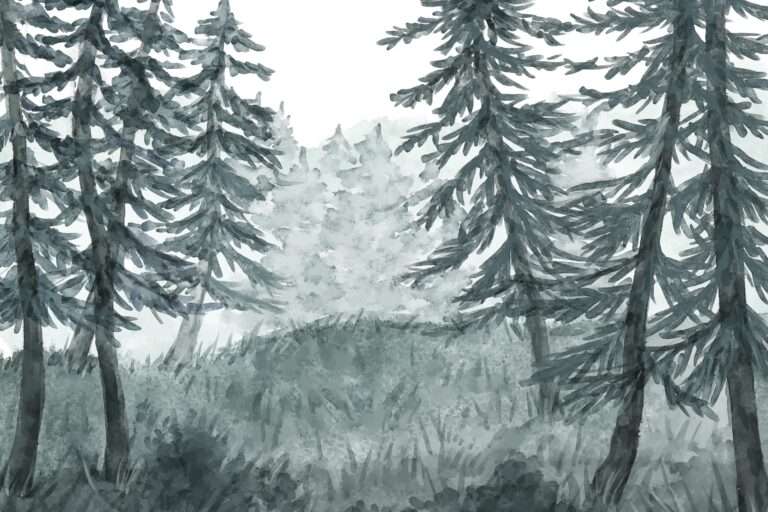
Painting Winter
Embracing the Winter Palette
Winter landscapes present a unique opportunity to explore a different range of colours and moods compared to the other seasons. When painting winter scenes in Procreate, focus on the subtle hues of whites, blues, and greys to capture the serenity and stillness of the season. Reflect the chill in the air with cool tones and muted shades, while bolder colours can be used sparingly to highlight focal points like a vibrant cardinal perched on a snow-covered branch or the warm glow from a cabin window.
Focusing on Snow and Ice
Accurately rendering snow and ice requires attention to the texture and how they interact with light. Snow can appear soft and fluffy or dense and packed, depending on recent weather conditions like fresh snowfall or melting and refreezing cycles. Utilize Procreate’s various brushes to create these textures, such as a soft airbrush for fresh snow and more granular brushes for icy surfaces. Notice how snow tends to collect on branches, rooftops, and other surfaces, creating distinctive shapes and forms.
Considering Light and Shadows
During winter, light is often diffuse, with the sun positioned lower in the sky, casting long shadows and creating a stark contrast between light and dark areas. Adjust your light source in Procreate to simulate the low winter sun, and experiment with cooler light temperatures to enhance the chilly feel. Shadows in winter scenes are not just grey but can contain hints of blue and purple, reflecting the colours of the sky and surroundings.
Adding Atmospheric Effects
Winter scenes are enriched by incorporating atmospheric effects such as falling snow, mist, or fog. Procreate’s layering capabilities allow you to add depth to your painting by creating these effects. Experiment with different opacity levels to balance visibility and enhance the immersion. Consider how these atmospheric conditions might obscure distant objects, adding to the sense of space and distance in your composition.
Incorporating Winter Wildlife and Elements
Incorporate wildlife like deer, foxes, or birds that can add life to your winter landscape. These elements can serve as focal points or add narrative interest. Pay attention to how animals interact with their environment during the winter, such as footprints in the snow or birds foraging for food. Additional details like barren trees with intricate branch formations, frozen ponds, and frost-covered foliage can further enrich your scene.
By leveraging Procreate’s extensive toolset and focusing on the distinctive aspects of winter, you can create captivating and realistic winter landscapes that convey the quiet beauty and stark tranquillity of the season.
Seasonal Transitions: Techniques for Blending Colors
Blending colors to depict seasonal transitions requires a nuanced understanding of how hues interact with one another and the natural progression of colors throughout the year. In spring, soft pastels and vibrant greens can represent new growth and rejuvenation. Techniques such as wet-on-wet blending in Procreate can help achieve the delicate transitions seen in blossoming trees and gradually brightening landscapes. Summer scenes, dominated by rich blues and lush greens, benefit from smooth gradient blends that replicate the intense saturation and sunlight typical of this season.
Autumn, with its warm oranges, reds, and yellows, can be effectively illustrated using layer blending modes that enhance the depth and complexity of foliage. Experimenting with Procreate’s Smudge Tool can help create the appearance of crisp, fallen leaves and the subtle changes in leaf color. Winter, on the other hand, often features more subdued palettes with cooler tones. Blend shades of white, grey, blue, and even purple to replicate the frosty, icy conditions. Employing brushes that mimic natural textures, like those for snow and ice, can add an extra layer of realism.
By understanding the palette and techniques best suited for each season, you can create seamless transitions in your artwork that reflect the changing environment. Layering different brush strokes and adjusting their opacity can help merge colors smoothly, ensuring that each seasonal shift looks natural and cohesive. Practice blending colors specific to each season within Procreate will enhance your skills in depicting the dynamic and beautiful transformations of the year.
Layering Techniques
Mastering layering techniques is crucial to elevating your digital artwork. By strategically building up layers and adjusting their opacity, you can create depth, texture, and subtle transitions that bring your scenes to life. For a deeper dive into the intricacies of layering and its impact on your artwork, check out this detailed article on advanced layering techniques. This resource offers a comprehensive overview and practical tips to enhance your understanding and application of layers in your creative process.
Crafting Seasonal Atmospheres with Watercolor
When crafting seasonal atmospheres with watercolor, capturing the essence of each season requires an understanding of color theory, brush techniques, and the unique characteristics that define spring, summer, autumn, and winter.
Spring
Spring is often associated with renewal and growth, featuring fresh, vibrant hues. To capture the spirit of spring, opt for a palette filled with pastel greens, pinks, purples, and blues. The key is to create a sense of lightness and airiness, often achieved by using a wet-on-wet technique. This method involves applying water to the paper before adding pigment, allowing colors to blend softly and fluidly, mimicking the freshness and delicacy of new blooms and budding leaves.
Summer
Summer, on the other hand, exudes warmth and intensity. Rich, saturated colors such as deep blues, lush greens, and bright yellows dominate this season’s palette. The wet-on-dry technique can be particularly effective here, where watercolor pigment is applied to dry paper, allowing for more control and sharper details. This approach is ideal for rendering the bold, vivid landscapes and sunlit scenes typical of summer.
Autumn
As autumn arrives, the color palette shifts to warm, earthy tones. Think of deep reds, oranges, ochres, and browns. These colors capture the richness and complexity of fall foliage. Employing a layering technique, where multiple translucent washes are applied over one another, can add depth and dimension to your work. This method allows you to build up the layers of color gradually, reflecting the intricate patterns and hues found in falling leaves and harvest scenes.
Winter
Winter scenes often embody a quieter, more subdued atmosphere. A limited palette featuring cool tones—whites, greys, blues, and subtle purples—can effectively convey the chill and stillness of winter. Techniques such as dry brushing, where a brush loaded with pigment but little water is dragged across the surface, can create textures that mimic frost and snow. Additionally, incorporating negative painting, where the background is filled in to outline lighter shapes, can highlight the stark contrasts and tranquility of a winter landscape.
General Tips for Weather Illustration
- Clouds: Use a soft brush to create fluffy, realistic clouds. Vary the opacity to add depth.
- Rain: Use thin, long strokes with varying opacities to illustrate rain. Add splashes on the ground for realism.
- Sunlight: Use the glow tool to add warm highlights and mimic sunlight filtering through objects.
- Snow: Use a scatter brush to add snowflakes, varying size and opacity for a natural look.
By carefully selecting a palette that corresponds to each season and employing specific methods such as layering, dry brushing, and negative painting, artists can capture the essence of spring’s vibrance, summer’s brilliance, autumn’s richness, and winter’s tranquility. Moreover, incorporating details like clouds, rain, sunlight, and snow can add realism and depth to your illustrations. Whether you’re a seasoned artist or a beginner, these tips will help you convey the beauty and diversity of weather in your artwork, making each piece a compelling visual narrative.
Discover the Procreate Watercolor Brushes of AF Brush Packs
When it comes to elevating your digital artwork, AF Brush Packs stand out as a trusted brand among artists. Our Procreate Watercolor Brushes, complemented by bonus paper textures, are designed by the eyes of an artist to bring an unparalleled level of realism and depth to your creations.
Invest in AF Brush Packs today and experience the difference that quality digital tools can make. Transform your creative process and produce artwork that truly stands out. With AF Brush Packs, you’re not just purchasing a product—you’re investing in your artistic journey.